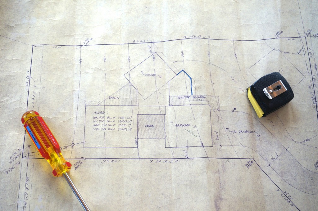
It’s been a while since I shared any remodeling news. That’s because most of the interior work we wanted to do on the new house is done and we’ve been enjoying a respite from projects beyond the ongoing purging and organization of stuff. But an early spring is upon us and a wedding party is happening here in June so I’m starting to focus on the garden and outdoor spaces.
As you may recall from earlier posts, the house was built in 1979. Set on a hillside and designed by architect Jim Jennings, it consists of 3 separate rectangles that connect at the entrance. The first rectangle houses a two story living room, the second the street level garage above a small laundry/pantry space and the third and largest rectangle features bedrooms above and below the kitchen/dining/family room.
The original design also included 3 deck areas – a narrow bridge-like walkway from the driveway to the front door, a triangular deck off the main level entrance on the view side of the kitchen and living room rectangles, and a small square deck between the family room and the wall beneath the garage. Still with me? 3 rectangles + 3 geometric decks = 1 pristine modernist structure.
Then came Owner #2 who hired a landscape firm in 1991 to create more garden space. A new deck and arbor were added to the front (you can see the bright blue line outlining the additional front deck dimensions above) and a series of bridges, walkways, staircases, seating areas, fences and shade trellises were built around the back to create a garden and access more of the remarkable view of the San Francisco Bay and the wooded canyon heading down to the water. I call it the Swiss Family Robinson school of architecture. It has a ramshackle, build as you go feeling that is clearly all wrong for the clean lines of the original 3 + 3 house. But as we contemplate repairs and reconstruction of the deck I find that part of the charm of the outdoor space is the tumble-down nature of these secondary decks. I’m pretty sure a modernist architect like Jennings would rip them off in a heartbeat. But I’m reluctant to let them go.
Time and money will limit what we do, but my mind is sorting out a direction to pursue. And so I’m curious. How have you reconciled the different aesthetic choices that a home with multiple owners will surely manifest? Did you embrace the eclectic mix or work towards restoring the intent of the original architect?
Something I’ve been thinking about this week. Also, these things:
Beautiful meditation on a wordless afterlife.
Some background on Bruce Lee’s philosophy to Be Like Water.
Why that WHITE & GOLD dress looks different to the rest of you.
And finally, this video about making the set for the latest Marc Jacobs fashion show featuring our daughter Claire. Cool stuff.
Happy Weekend All!


