 The next five weeks will be a blur of projects and packing but I’ll try to take a moment every Monday to capture the process.
Today we made our final pre-closing visit to the house to meet with the painter and carpet seller to get bids for projects best tackled before we move in. After years of living in older houses that took to color like children to chocolate bunnies, it’s strange to be parsing shades of white. But that’s what this house is telling us it needs. Designed in 1979 by San Francisco architect Jim Jennings, the home is unapologetically modern. Clean geometry, high ceilings and banks of windows oriented to the adjacent PG&E green belt and bay view give the main rooms a gallery-like feeling.
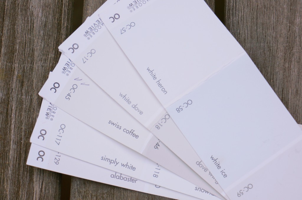
The seller had an affinity for Arts & Crafts architecture and paint colors and did a fine job incorporating them into the house, but we are interested in returning it to its modern roots. Accordingly, I called Jennings’s office to see if he preferred one white over another. Jennings happened to be in and graciously gave me a little history on the house–one of his first projects–and said that though he couldn’t remember the colors he’d specified thirty-five years ago, today he tends to use Benjamin Moore’s “White Heron” or if that seems too severe, “Swiss Coffee.”
Armed with “White Heron” and “Swiss Coffee” paint chips (along with a handful of others) we tried to envision our gallery walls. The painter said either would do, though he personally likes “White Dove” (often recommended by design professionals, along with “Simply White” and “Linen White.”)
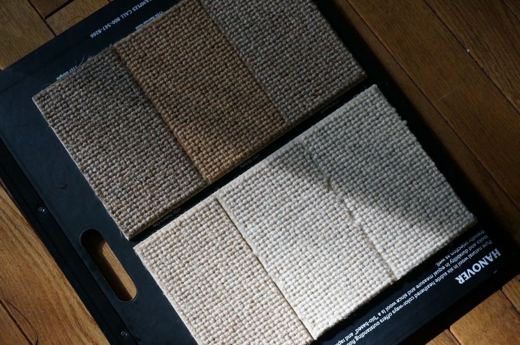
Tired of squinting to see which ghostly shade best suited the bleached wood ceilings, we moved on to the bedrooms and considered a sea of flax/ivory/alabaster carpet samples. Pity the poor carpet salespeople trying to sell style during this heyday of neutrals. The winner today was a wool berber named “Divinity” (though it looked far more like “Honeycomb” to me.) But a late afternoon call from the carpet showroom said they could find a similar color in a large remnant that could save us some money–would I be able to come in tomorrow to see the sample? And so it begins.


3 Comments
Oh do educate me. Choosing whites makes me sob.
We did a Karastan wool and B.M. Simply White and White Cloud. Can’t wait to see your new tree house!
And they turned out beautifully!