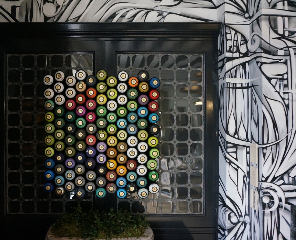
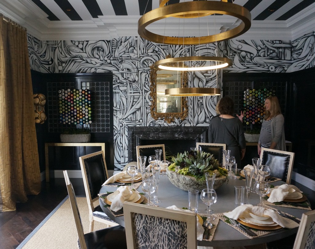
If this year’s San Francisco Decorator Showcase is any indicator, color is making a comeback. The hushed neutrals of the past have been replaced by sumptuous hues and bold graphics that feel fresh and invigorating. For example, in Cecilie Starin’s black and white dining room the abstract murals by San Francisco street muralist Ian Ross along with inventive art pieces (see above) made from street artists’ spray paint cans embrace the unconventional.
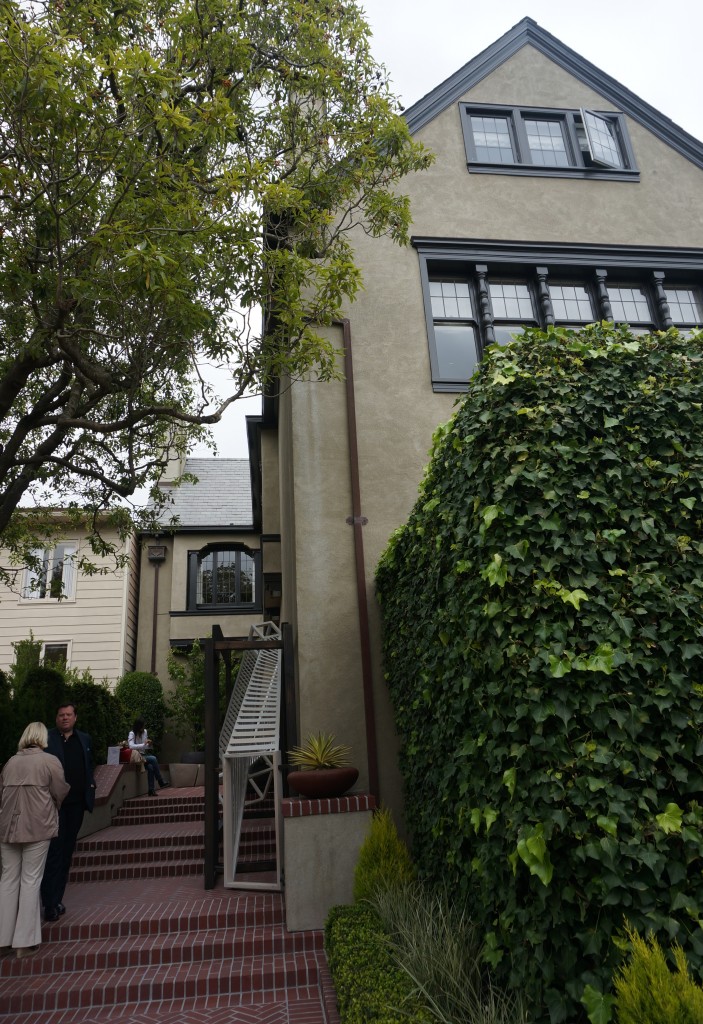
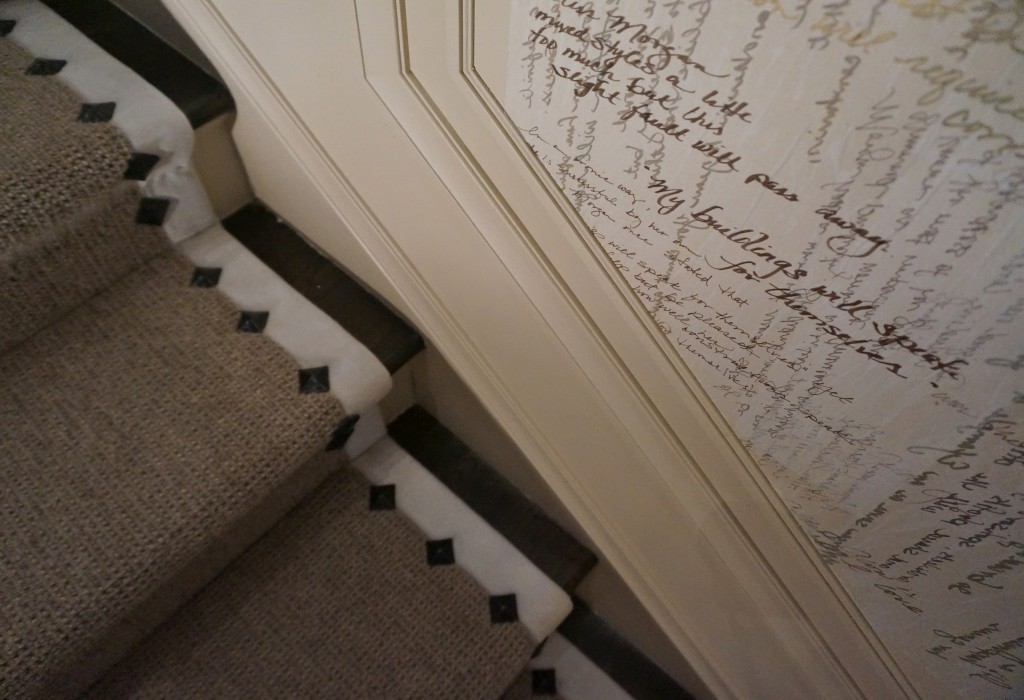
Which is only fitting since this is a home that celebrates a famed woman architect’s progressive vision. Julia Morgan designed the house in 1917 for “Dried Fruit King” Abraham Rosenberg and his wife Alice specifying an unusual choice of material–concrete–for the Tudor style home. You can see some of Morgan’s own quotes lining the entrance stairway designed by Candace Barnes.
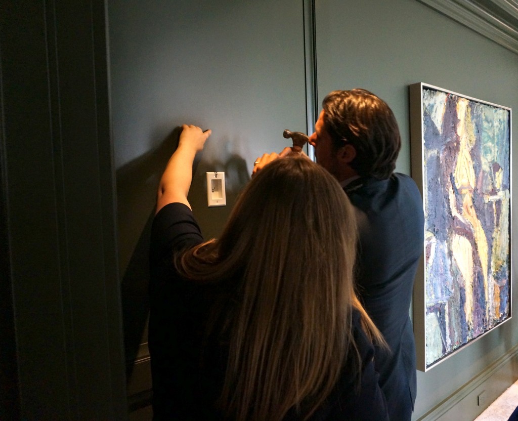
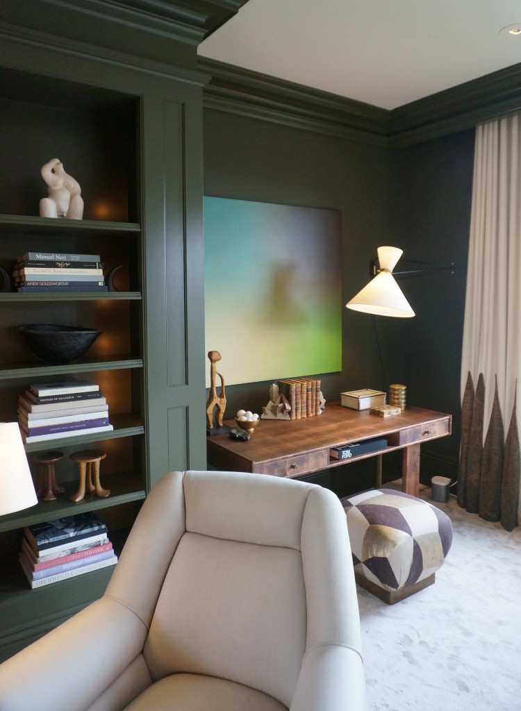
Upstairs on the press preview day, designer Will Wick hung one last piece of art on the moss green walls of his elegant master bedroom. The soothing but sophisticated wall color combined with cream accents sets off the art beautifully.
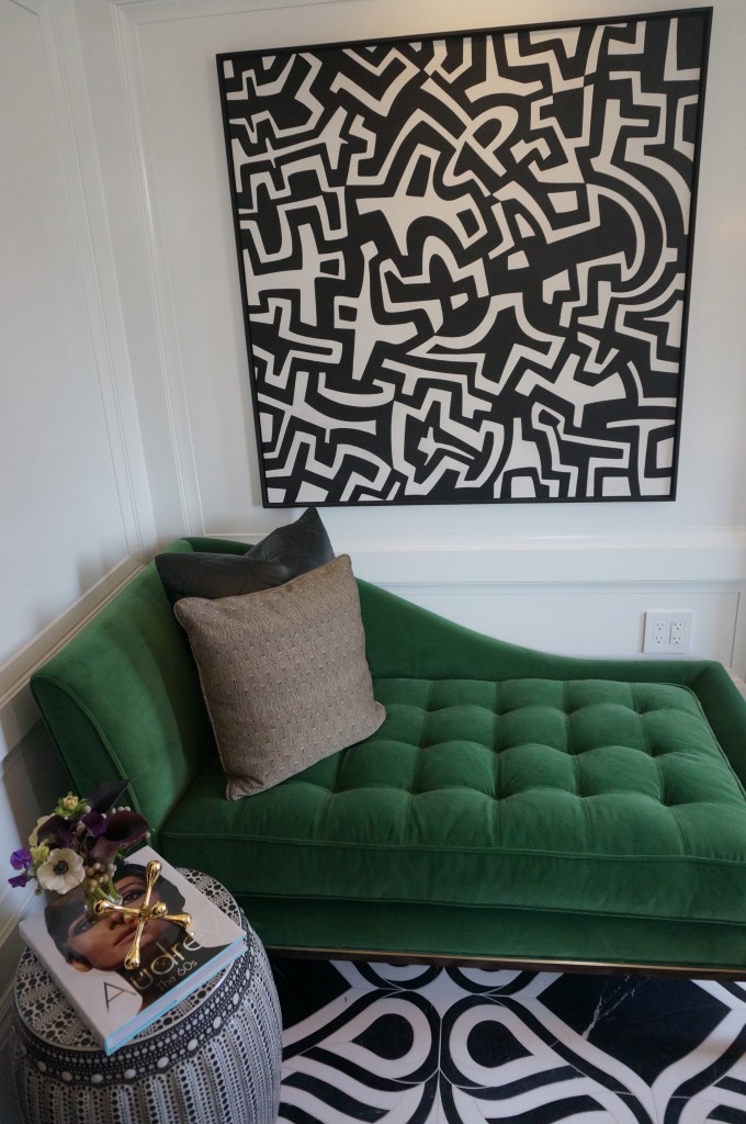
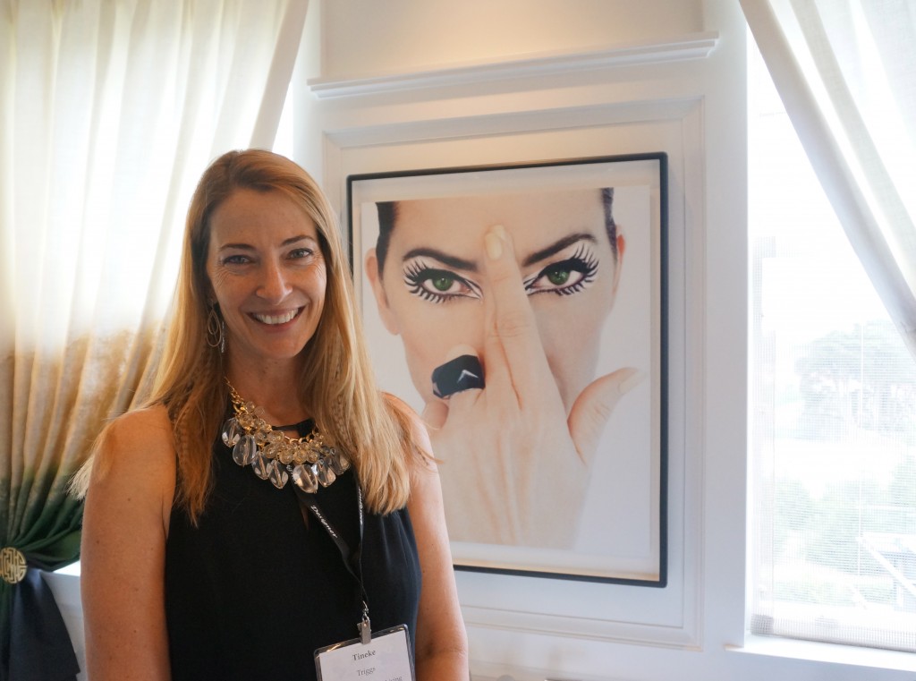
Next door, designer Tineke Triggs paired an emerald green chaise with graphic tile and Keith Haring-like art. When pressed Triggs revealed that the large photo of the cat-eyed woman–inspired by a Vogue magazine cover from the 70s–was Triggs herself!
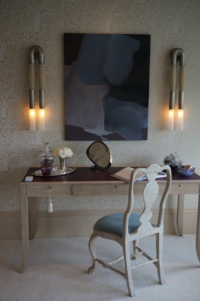
Adjacent dressing rooms feature neutral backdrops with subtle swaths of color. Hers is a soft cocoon of pastels while His features edgier grays and blacks.
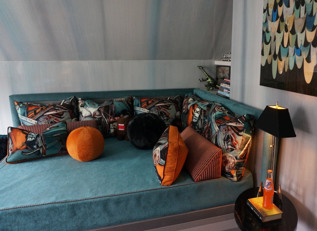
Teen boy’s gear references the colors in the custom bed coverings made from fabric designed by Jean Paul Gautier and discovered in France by fabricator Susan Chastain. Decorative painter Willem Racke’s lacquered ombre’ finish on the walls was inspired by rock striations along the California coast.
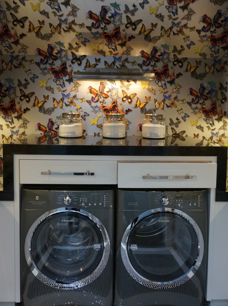
Two upper rooms showcase whimsical wallpaper. The laundry room features bright butterflies on the walls and custom drying racks above the washer/dryer.
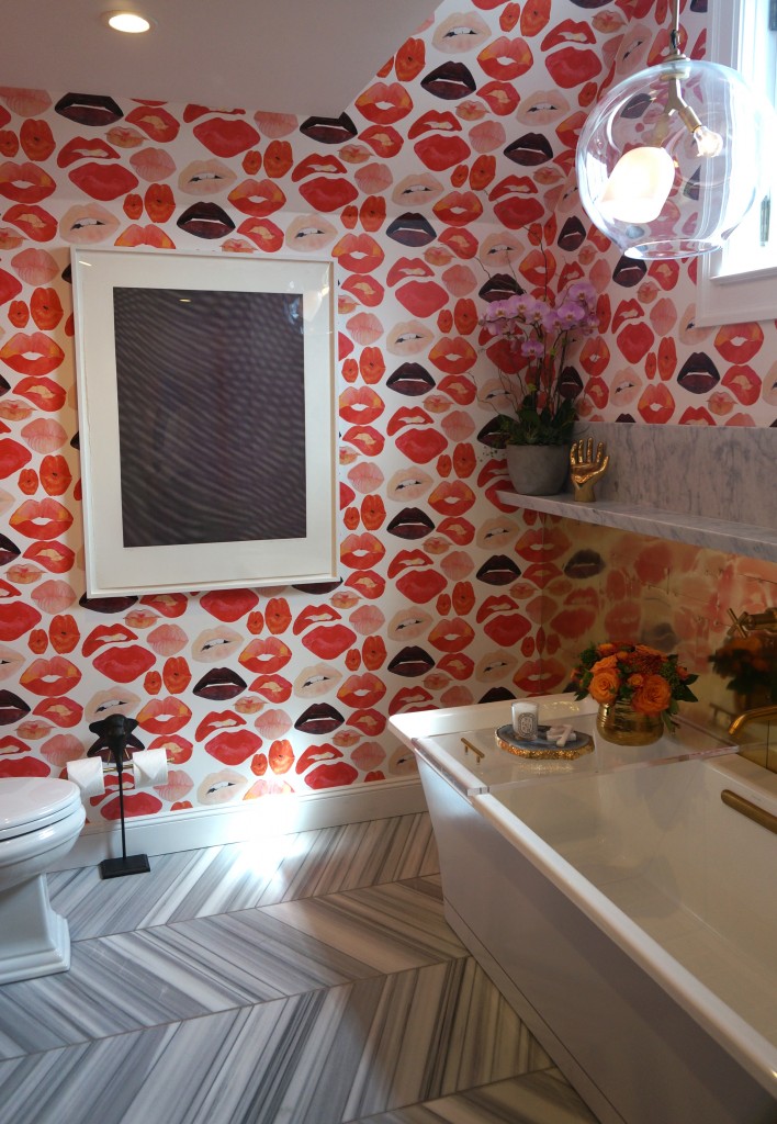
A smoochy wallpaper covers the walls in the upstairs bath and seals the whole showcase with a kiss.
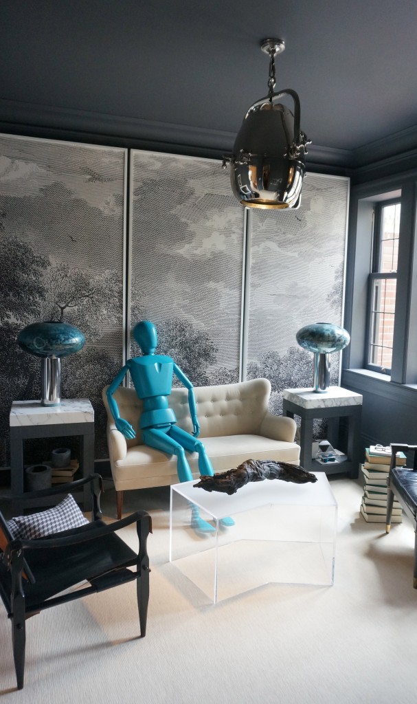
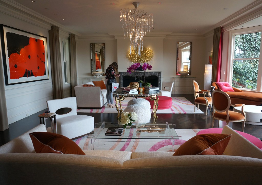
The lip colors recall the palette of the glam living room by Philip Silver Design.
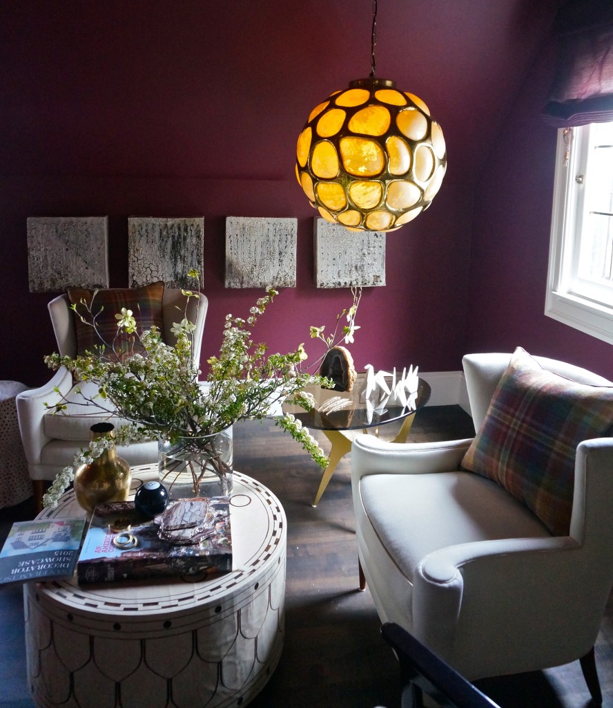
As well as the merlot colored walls of the game room. “We decided to embrace Pantone’s controversial color of the year,” says designer Jeff Schlarb. “It’s actually quite lovely to watch it change throughout the day.”
If you live in the San Francisco Bay Area, plan to tour this beautiful showcase house before it closes on May 25, Memorial Day. Details can be found at DecoratorShowcase.org.




2 Comments
I would love a how-to on how one actually attends such a thing, and then, how one goes through the rooms without screaming – since so many of them are right over the top. How to learn, in other words, in the face of such overwhelm.
Great idea! Stay tuned for a post dissecting the take-away from one of my favorite rooms in this year’s showcase.