Look for an extensive overview of the San Francisco Decorator Showcase in the Bay Area News Group papers this Saturday, but in the meantime here’s a peak at design elements that felt fresh and noteworthy this year.
Contemporary Art as Inspiration
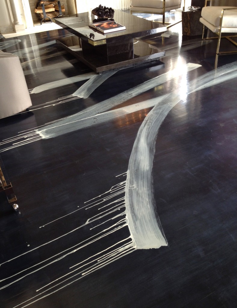
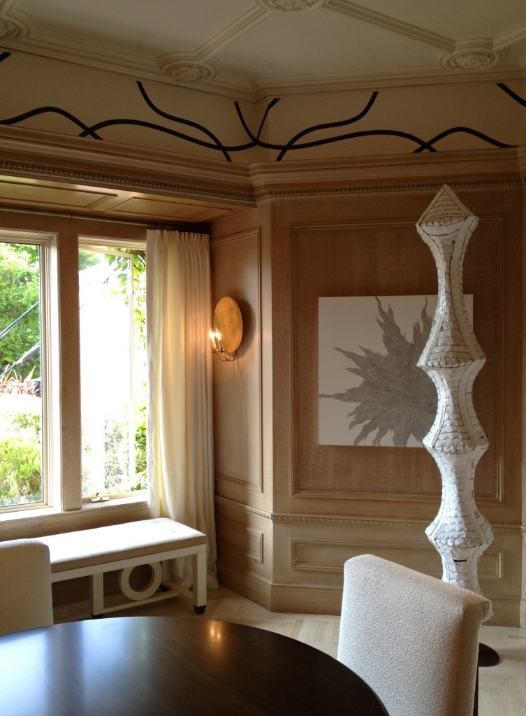
Check out the Cy Twombly inspired floors in Catherine Kwong’s living room, above. See those splashes and swirls? They set the tone for this entire showcase house and they’re likely to be the thing people are still talking about in years to come. Similarly, Heather Hilliard looked to the public art of Sol LeWitt to create the painted detailing on the upper walls of her dining room.
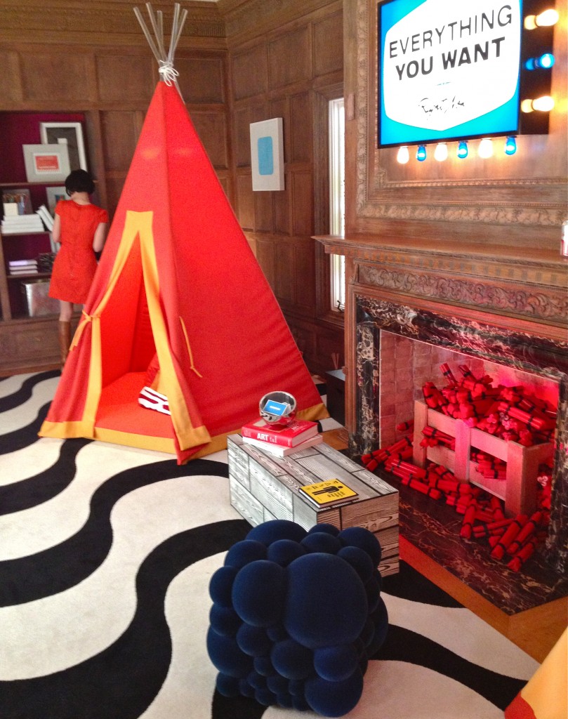
And Martha Angus and Esche Martinez anchored their exuberant playroom with a op-art inspired custom carpet.
Oceanic Blue
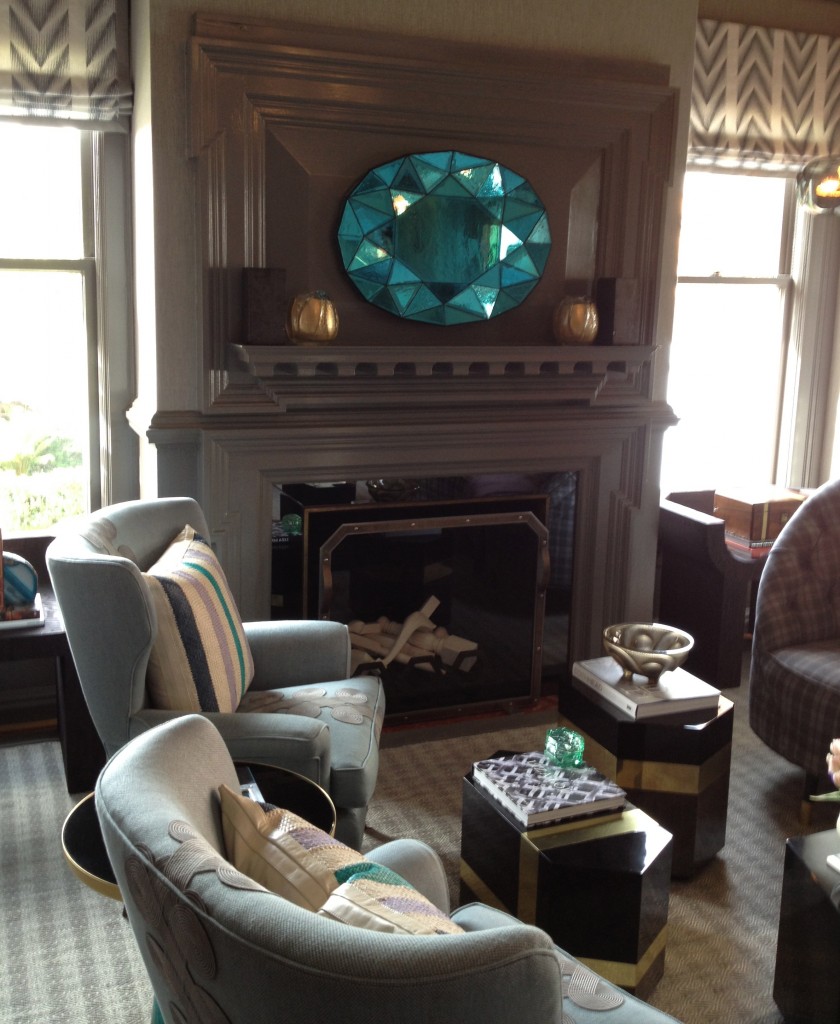
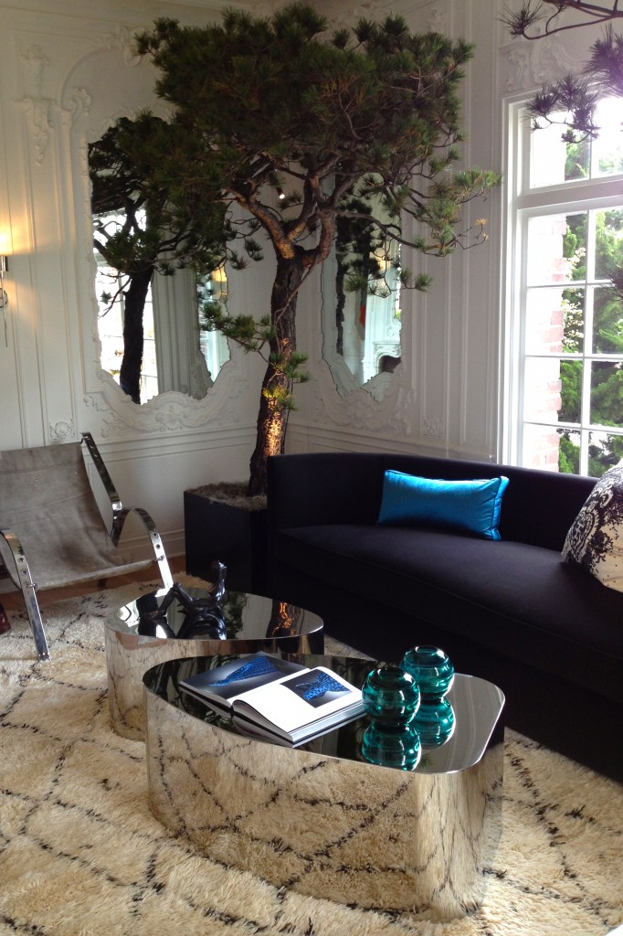
Though black and white was the predominant color theme of the showcase, the #1 accent color was a rich turquoise blue. Kelly Hohla hung it over the mantel by way of this mirrored “jewel” in her Makers Mark Retreat.
Matthew Leverone used it several ways in his ground floor Salon.
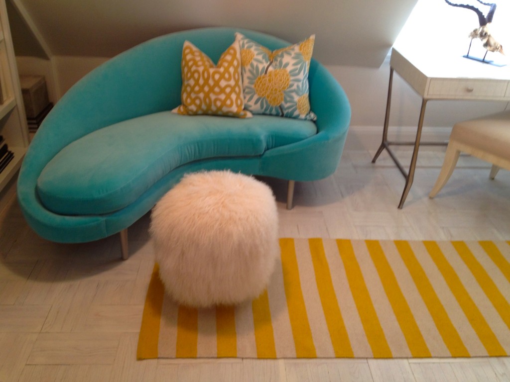
Kriste Michelini welcomed visitors to her cozy writer’s retreat with this cheery velvet sofa in the showcase’s signature color.
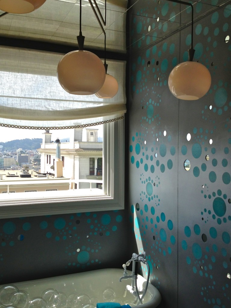
Decorative painter Willem Racke’ used it for his cut-out mirrored wall mural in Emilie Monroe’s 3rd floor bath.
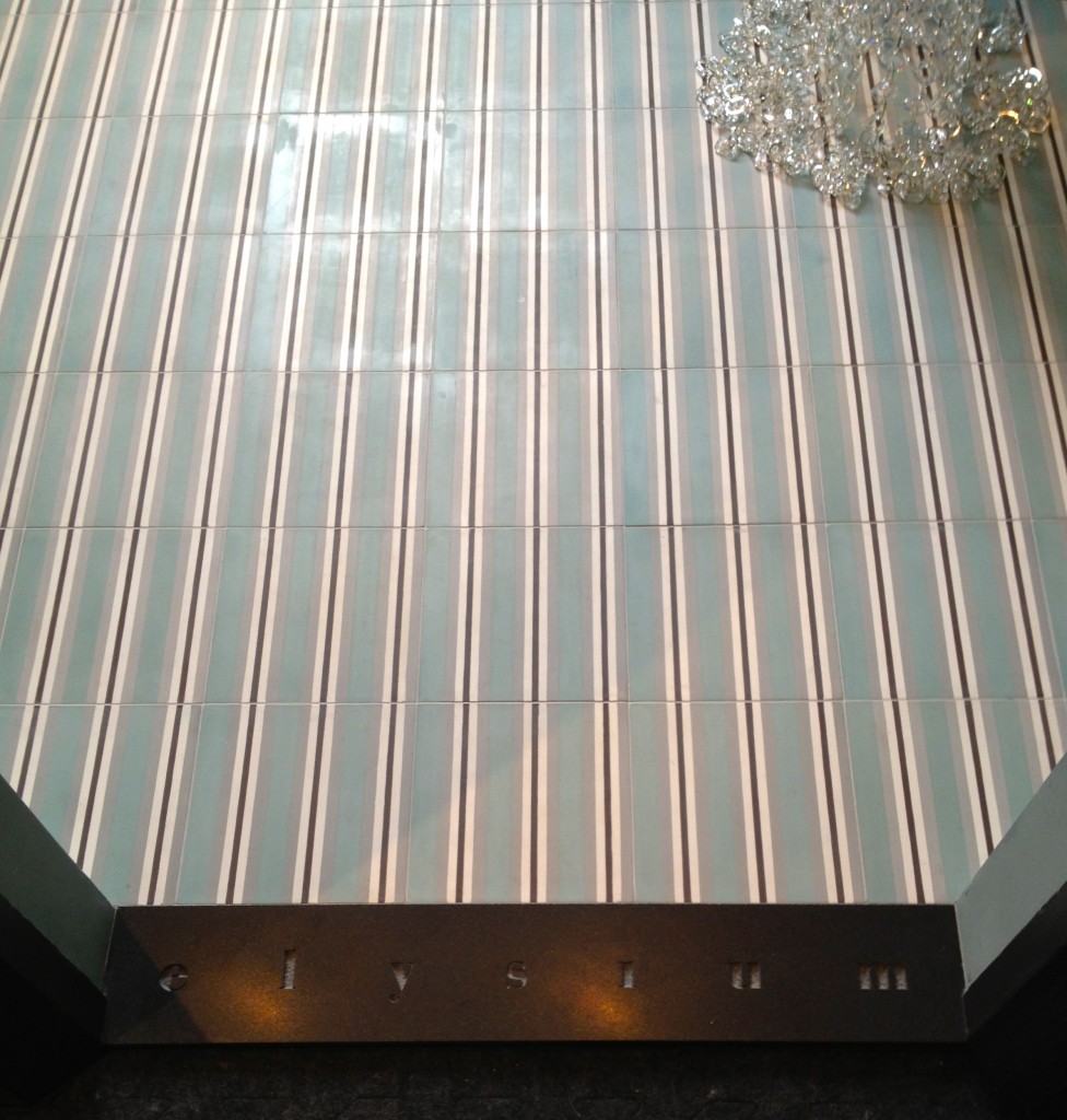
And Alfred Gregory specified it for this custom tile by Waterworks in the “Elysium” guest bath (note the cool custom threshold while you’re here.)
Living Walls
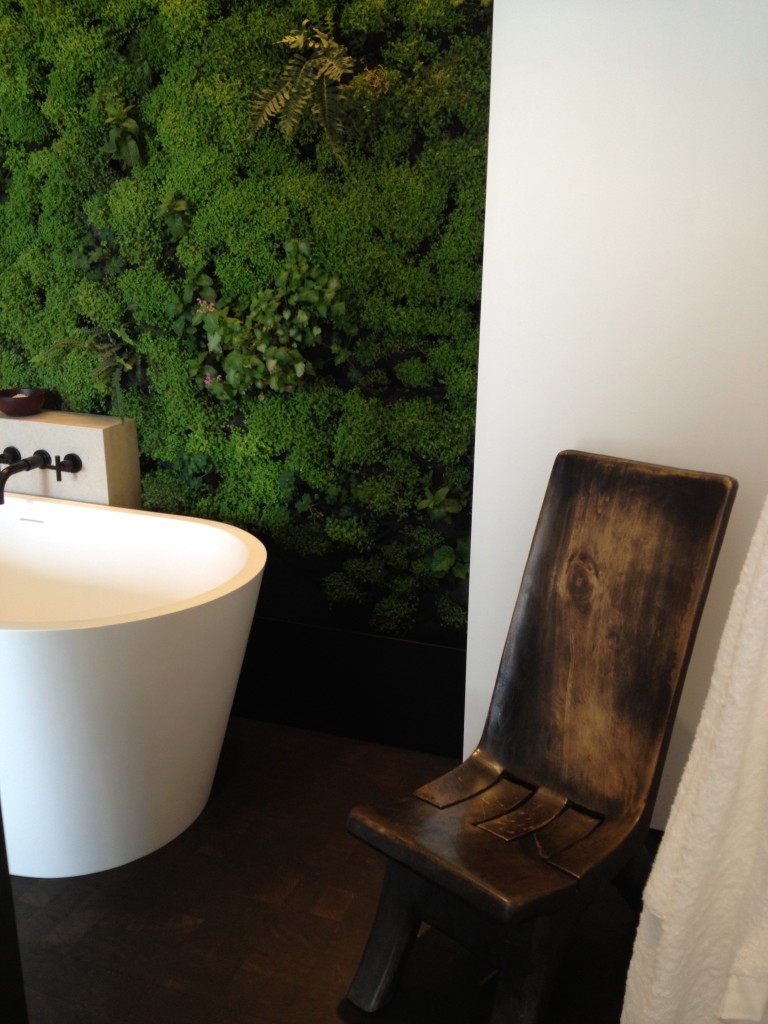
Vertical gardening can happen just about anywhere, including this sculptural bathroom by Soil Studios. The plants in this bath wall include French lavender and mint which can be snipped right there to scent the bath.
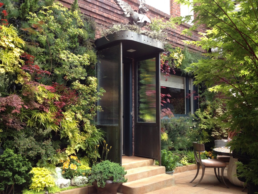
The same technology was used to create this gorgeous courtyard garden off the kitchen. The befores are truly incredible–nothing was here besides bare brick wall before Living Green designed and installed these living walls. Glorious stuff.
Statement Lighting
But living walls weren’t the only artful designs reaching skyward–unusual lighting did as well. Here are some of my favorite examples.
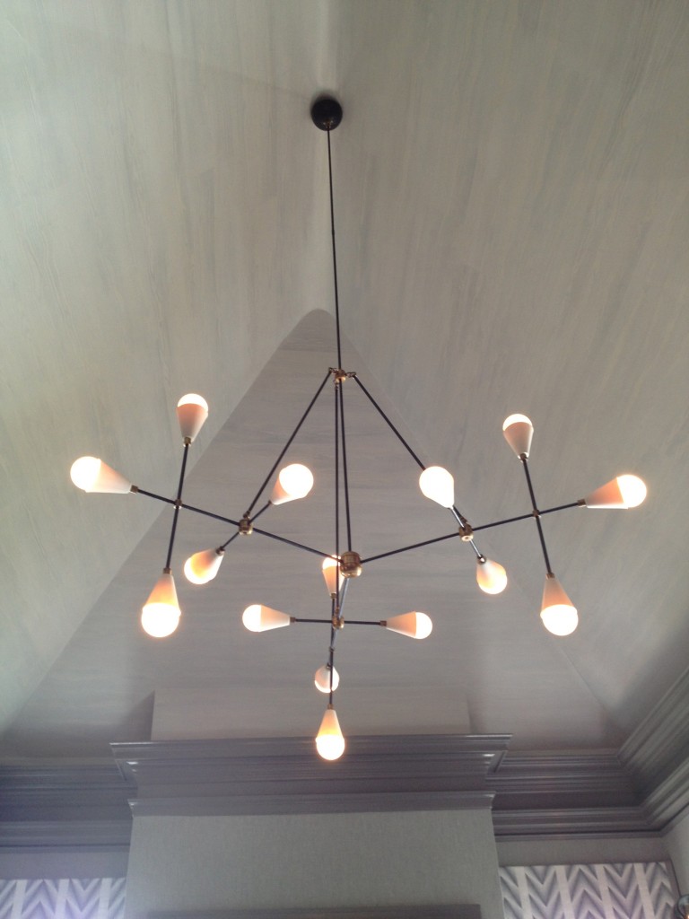
Kelly Hohla used this mobile-like fixture to draw your eye to the unusual pitched ceiling in the Maker’s Mark retreat.
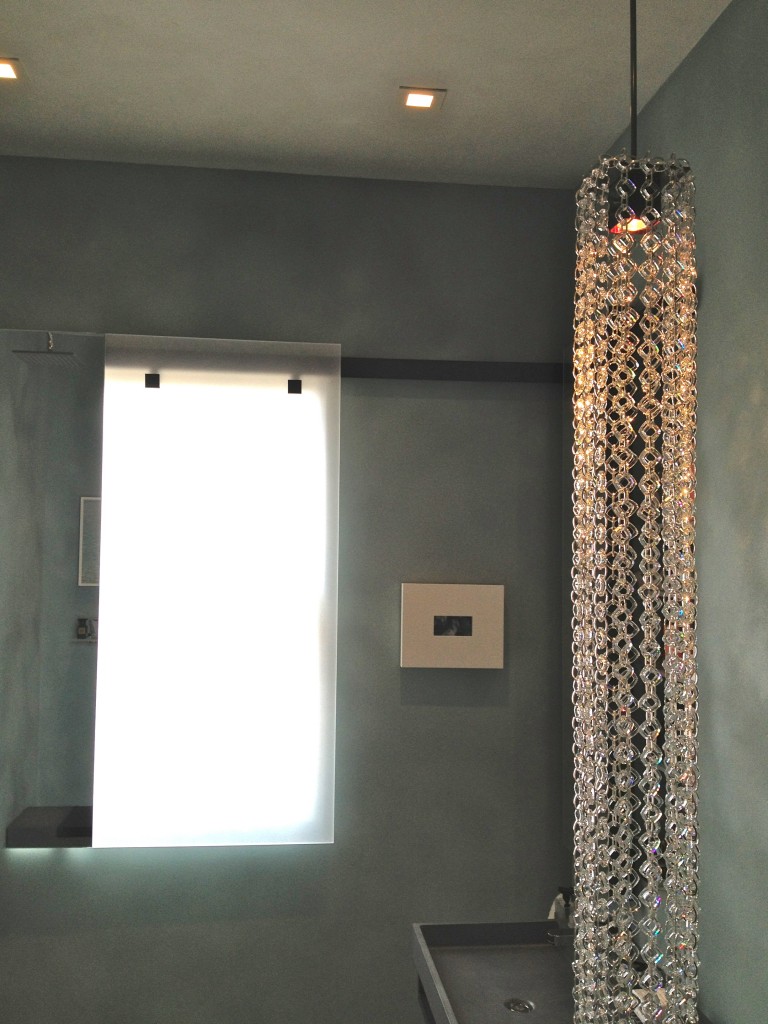
Alfred Gregory chose this glass chain link fixture both for dramatic effect and because it would stand up to the open shower in the room.
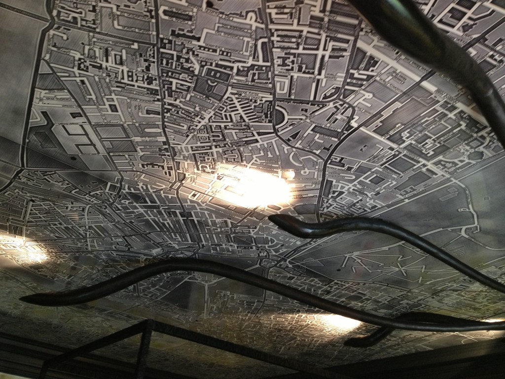
Gioi Tran commissioned a creepy crawly light fixture to fan out across this resin map of London in the teenage girl’s room.
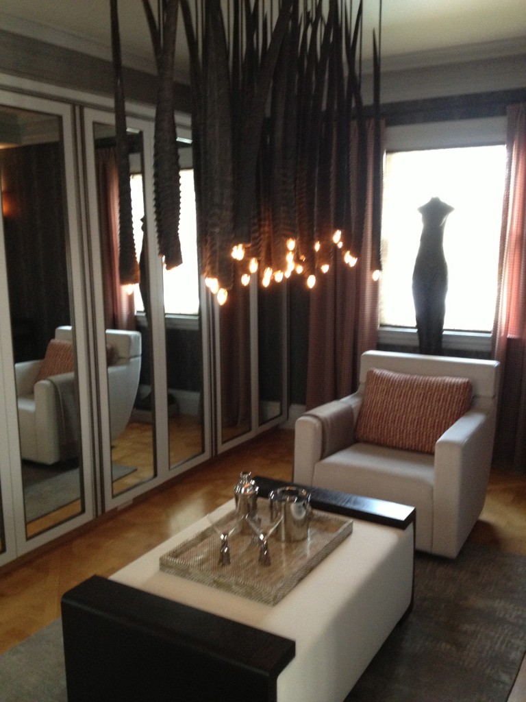
Zoe Hsu paired this undulating fixture with python wall paper in the master sitting room. Sssssspectacular.
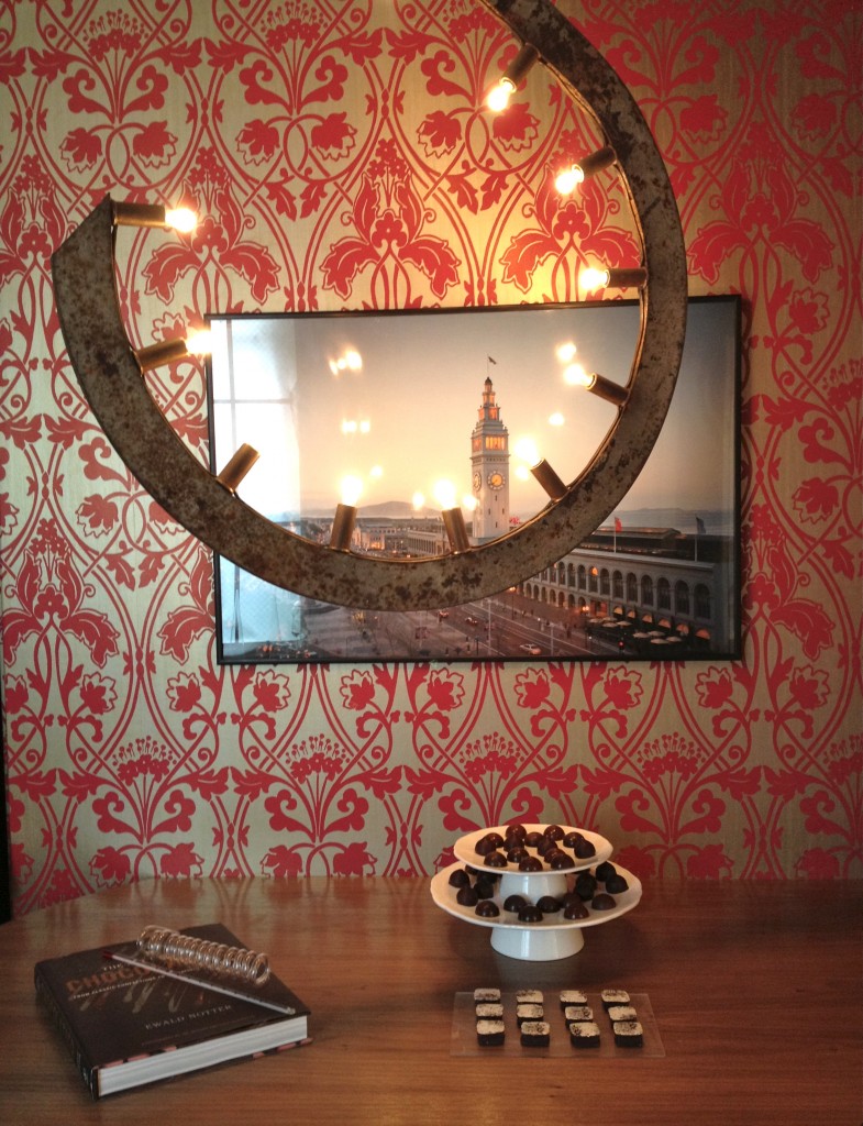
And Stephanie Marsh Fillbrandt used a hook-like light fixture from Coup d’Etat to add industrial heft to her sweet Chocolatier’s Lab.
Treat yourself and maybe a friend–mom!–to a trip to the showcase before it closes on May 27. You’ll come away inspired to try a new thing or two in your own personal showplace.
