Friday Things: Bringing Back Our Girls for Mother’s Day

The Nigerian schoolgirls kidnapping story makes me want to weep.  How can pockets of the world continue to resist efforts to educate women? Aren’t the men of Boko Haram (translated “Western education is a sin”) also fathers, brothers, husbands and sons? Would they enslave their own mothers, sisters, wives and daughters? I grieve for the parents who wanted their daughters educated and instead lost them to these madmen.

On this Mother’s Day weekend, I want to thank my own mother and father for educating me.  My mother’s mother (and all the generations that preceded her) never went to college.  My mother dropped out to have a family–starting with me–after she married my dad. She nevertheless encouraged me and my eight siblings to obtain a college degree and couldn’t be prouder that several daughters and granddaughters have gone beyond that to attain advanced degrees.

The photo above is of my daughter Sydney at a recent year end gathering of the Mormon students at Harvard Law School.  The entire student body at HLS is 49% women, but the Mormon group is clearly skewed towards men. That’s not because Mormons don’t believe in educating women–46% of the students at BYU are women and 1/3 of the students at the BYU law school are women—but there is a strong cultural bias towards starting families early and a pervasive expectation that women will stay home to raise children. Every woman struggles with the question of work/life balance but for Mormon women there is less support to figure out the work part of the equation so many girls interrupt their education to marry and have children.

As I was finishing up my junior year at BYU, a boy I was dating told me that my intention to go to law school when I graduated was misguided, perhaps even sinful. He said that the right thing for me to do was to get married—to him, of course—and start having children. He was surprised when I not only refused to take his advice/proposal but broke off our relationship.  Fortunately, kidnapping was not an option.

Over time I suspect larger numbers of Mormon women will start to fill graduate school ranks, much as they have undergraduate. I say that because one of the key tenets of the Mormon faith is that “the glory of God is intelligence.” Also because there is such a strong legacy of smart Mormon women doing heroic things to raise their families and develop their communities.  These women—like my grandmothers, my mother, aunts and mother-in-law—may not have had extended formal educations but they nevertheless provided examples of curiosity, wisdom and an enthusiasm for learning even as they tended to the home front. I wanted to do right by them and I expect so will my daughters and son and their children.

So back to the Nigerian schoolgirls.  What can be done for them and other women denied educational opportunities?  Donations to Kiva or organizations that support education for women are a step in the right direction. You might also consider spending this Sunday—Mother’s Day—praying for one of the missing Nigerian school girls. You can sign up to pray for a specific girl—including Tabitha, Ruth, Aisha, Blessing or one of the nameless ninety-six–here. I’ve chosen “Beloved Daughter 58” to coincide with my own birth year and to recognize how lucky I was to be born into a family who made sure this beloved daughter was educated.

Posted in Spirit | Tagged , , , | 2 Responses

Moving On: Walls & Cabinets

Week 3 and there’s clear progress in the house. Most of the rooms are painted, the kitchen cabinets and front door are refinished, and the kitchen and powder room renovation projects are coming into focus.That said, there were enough hiccups this week that I ended up one evening pretty much in a fetal position. No major disasters did me in, just a steady stream of miscommunication, escalated costs, dead ends and false starts. “Sounds like you had a ‘gumption trap’ kind of day,” said my friend Nedra as I rehearsed the day’s woes the next morning. Defined as an event or mindset that can cause a person to lose enthusiasm and become discouraged, the term ‘gumption trap’  comes from Robert Pirsig’s Zen and the Art of Motorcycle Maintenance. Coincidently, that’s a book M.J. asked me to read while we were courting (the same year this house was built!) In turn I assigned him The French Lieutenant’s Woman by John Fowles–but I digress. A few days later, things are looking up. Here’s a peek at this week’s progress:

After asking design professionals and friends about their favorite white paint color, I had the painters put some big samples up near the whitewashed ceiling to see what played well with its pink/gray tones. From left to right – Bone White, Linen White and Swiss Coffee. Later on joined by White Heron, Dove White and Timid White.

My friend Jana, a color consultant and the poet behind Green Olive Archives, weighed in by encouraging me not to pick anything with a pink base because it would skew the whole house heavily pink–”which could be limiting.” Otherwise, she assured me that any of the whites I was considering would be just fine. When I worried about the white walls being too bland, she reminded me that in this modernist house it will be my stuff that will bring color and interest. “But will the house feel too cold?” I said, confessing that I was leaning towards Swiss Coffee, one of Jenning’s picks. Jana noted that it was considered a warm white and one of the easiest ones to work with. “If the rooms feel too cold on a rainy winter day—or a foggy summer one–add something as simple as a bowl of oranges and it immediately warms up a room,” said Jana.

She also confirmed what I was seeing on the walls–Swiss Coffee has a brown base which tones down the pinkish cast of the ceilings and now the color of the refinished cabinet fronts. Hoping to stave off a full blown kitchen remodel, we wanted to keep the original cabinets but over time  the varnish was peeling on the fronts near the windows and over the stovetop and had turned a plasticy yellow. You can see the difference, above, with the yellowed cabinet front on the left, the stripped natural front on the right and the cerused cabinet front in the middle.

I asked William Anderson, an Oakland-based designer with a classic, commonsense approach to design, to walk through the house and weigh in on a few decisions. He felt strongly that we should try to refinish the cabinets and not paint over them. Fortunately, our painter Steve was up to the challenge and stripped the old finish off  then found a lime wax that he put over the natural oak to give it a cerused finish. The end result looks modern but retains the original vision of the house. We’re not sure if the stone countertop was original (were they doing stone in 1979?) but it’s a nice piece of green granite and it seems such a waste to have it end up in a dump heap. My only hesitation is that the vaguely pink and green color scheme recalls my original everyday wedding china–Mikasa’s Silk Flowers (so 80s!) Perhaps down the road we’ll change out the tile, but it’s also in good shape and not unattractive. William agreed we should keep both the countertop and tile for now. New hardware and appliances will help update the room.

Besides the track lighting in the kitchen there is only one overhead light in the whole house and that’s in the entry. It’s a chance to make a statement so I want to take the time to find just the right thing for the space. In the meantime, I had the painters hang a simple ceiling fixture that I already owned from Berkeley lighting designer Sue Johnson. It echoes the entry pole (painted a dark grey per William’s suggestion) and really classes up the joint, don’t you think?

Here are some of the painters on a plank stretched between two ladders installing the fixture. This rigamarole does not seem like something we want to replicate every time we need to change a lightbulb. (Broken hip, anyone?) So that will need to be taken into account when selecting the ultimate fixture for this space.

The painters are pausing for a week to work on a previously scheduled project. A carpenter will step in to modify some of the kitchen cabinets for the appliances and tackle some smaller projects at the entrance and in the master bedroom. Then the painters will return to clean things up. Out of order, I know—but with the quick close of the house we’re scrambling to schedule workers when they’re available.

When it all gets to be too much, I’ll try to remember the morning I was out on the back deck and saw two foxes chasing across the ridge, their buff-colored tails lighting up the shade of the native oaks. Maybe the  memory of those lovely creatures–and the desire to be up on the ridge with them–will help me retain the gumption that got trapped earlier in the remodeling chaos.

Posted in Shelter | Tagged , , | 4 Responses

Ten Top Designers’ Favorite White Paint Colors

In my quest to find the best white to paint the interiors of our new house, I asked ten designers participating in this year’s San Francisco Decorator Showcase to tell me about their favorite white paint colors.  Here’s what they had to say:

“Any color from Benjamin Moore’s* Color Story Collection is good—they have so much pigment that they all work.” – George Brazil

“I like ‘Elephant Tusk.’  It’s not a true white and has a little gray in it.  Of course, it all depends on what you pair with it.” – Cecilia Sagrera-Hill

“‘White Cloud’ is super clean and white—it’s pure but not cold.” – Steven Miller

“‘Decorators White’ is very clean. So many whites turn yellow, but this stays true white and works well with bright colors.”—Tineke Triggs

“‘White Dove’ is the perfect neutral.” – Shelly Cahan

“I’d use ‘Decorators White’ or ‘White Dove’ if you want a white white with a little warmth.” – Antonio Martins.

“‘Linen White’ is like warm butter,” says Geoffrey DeSousa.  “I tend to stay away from grey whites like ‘China White’ but if you need a cooler white I’d recommend ‘Atrium White.’”

“Monroe Bisque’ is really pretty—it’s creamy and goes well with green tones.” – Jamie Belew

“‘Navajo White’ is very warm with a little depth to it; other whites can be too hospital looking.  Farrow & Ball’s ‘White Tie’ is a good creamy white but it needs a lot of light or it gets too grey.” – Fleur Keyes


“‘Marscapone’ has nice warmth without as much color as ‘Linen White’ but if you’re looking for a great crisp bright white, try ‘Super White.’” – Steve Henry

The choice couldn’t be clearer now, could it?

*All paints Benjamin Moore unless otherwise specified.

Posted in Shelter | Tagged , , , , , | 2 Responses

Moving On: Demolition

As a design writer, dare I admit that the older I get the less interested I am in renovation projects? There are just too many other things I want to focus on as time speeds up (read this for more about that.) And so I hoped that our next house would be pretty much “done.”  Or at least done enough we could move right in and then, when we felt like it, pin images of furniture we might get around to buying some day. Or not.

But the basics like paint and carpet (see last week’s post) unfortunately needed to be addressed as well as some nonworking items like the refrigerator, bathroom fans, exterior lights and garage door opener. Mostly manageable stuff.

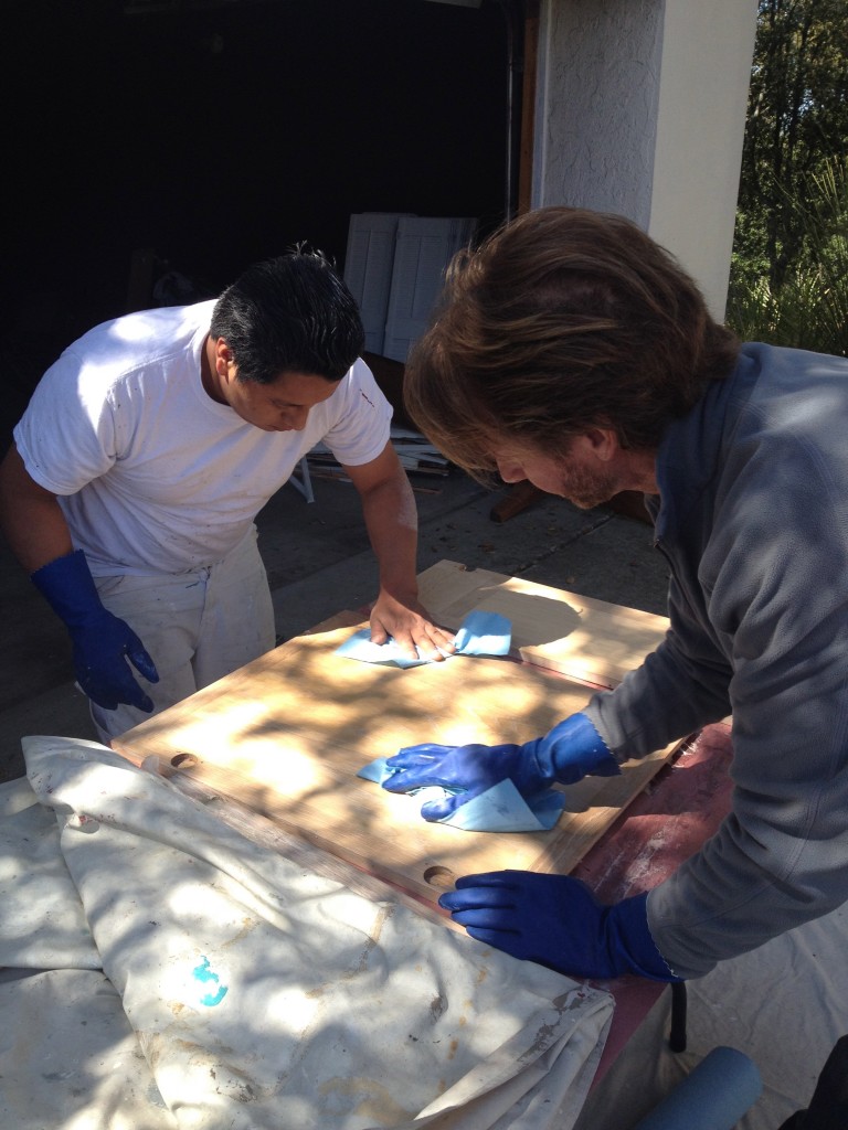
The big ticket renovation items—the kitchen and bathrooms—could all use some updating but for now we’d just polish them up a bit. For example, while the paint crew is on site we’re having them refinish the kitchen cabinet doors.  Here’s Steve Vaughn and his crew foreman Helo stripping doors in our driveway this morning. Bless them.

We decided we could live with the bathrooms if we resurfaced the master shower and guest bathtub.  But that didn’t solve the problem of the odd powder room layout. The vanity was tucked into a corner and the countertop extended to the opposite wall with an undercounter opening that made it seem like it was intended to be used as a dressing table (weird for a powder room.) The sink was also exceptionally worn. So on our first day back in the land of homeownership–when we were just going to pick paint colors–M.J. and Steve decided to rip out the vanity. Which leaves us with this—missing floor tiles, off-center exposed plumbing and our first remodeling project underway.

So much for my plans to slowly, minimally, fix up what needed fixing.  But I’m rallying. Even the best taste isn’t your own taste.  Being forced to make a place your own can be, to quote the queen of home projects, “a good thing.” Right?

Posted in Shelter | Tagged , , , , | Leave a comment

San Francisco Decorator Showcase 2014

All that’s gold glitters and shimmers (matte is in!) at this year’s San Francisco Decorator Showcase.  Held in a grand 1907 brick mansion in Presidio Heights, this showcase house offers the chance to see some of the best Bay Area designers showcasing their best work. The show runs through May 26–go to www.decoratorshowcase.org for tickets.  Here’s a sneak peek at some of the details that shone brightly–like the living room fireplace screen–at the Press Preview this week.

Modern art–like these butterflies suspended in an infinity mirror in SagreraBrazil’s dining room–dazzled.

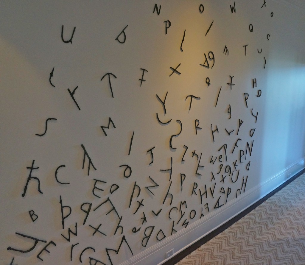
Or tumbled down a stairwell wall like these hand cast bronze letters and symbols in the hall outside the library.

The white on white library by Geoffrey De Sousa featured hundreds (thousands?) of coverless books. “The pages weren’t quite white enough so we hand-painted them,” says De Sousa.
Steven Miller worked with the opposite end of the color spectrum to create a dramatic black and gray kitchen that is House Beautiful’s “Kitchen of the Year.”
Both Miller and Antonio Martin chose to paint their floors bright white.
Here’s another shot of Martin’s joyful deconstructed Portugese tiles (painted by decorative painters Katherine Jacobus and Linda Horning.)  For more details about this showstopping room, go to Diane Dorran Saeks extensive feature at The Style Saloniste.
No corner was left untouched including the chalkboard ceiling of this boy’s room by Shelley Cahan.
And the Jackson Pollock inspired ceiling in “Lily’s Pad” by Trineke Turk.
Miller inset this magnetized crystal light fixture in the kitchen’s ceiling.
While Sunny K. Miller hung a real life puffer fish from the ceiling of her upper floor bar.
Which reminded me that one of the most memorable sights of the day was seeing the old Bay Bridge coming down on my way into the city.
Look for more about the showcase next week in my Bay Area News Group story.
Posted in Shelter, Style | Tagged , , , , , , , | 5 Responses

Moving On: Carpet & Paint

The next five weeks will be a blur of projects and packing but I’ll try to take a moment every Monday to capture the process.

Today we made our final pre-closing visit to the house to meet with the painter and carpet seller to get bids for projects best tackled before we move in.  After years of living in older houses that took to color like children to chocolate bunnies, it’s strange to be parsing shades of white.  But that’s what this house is telling us it needs.  Designed in 1979 by San Francisco architect Jim Jennings, the home is unapologetically modern.  Clean geometry, high ceilings and banks of windows oriented to the adjacent PG&E green belt and bay view give the main rooms a gallery-like feeling.

The seller had an affinity for Arts & Crafts architecture and paint colors and did a fine job incorporating them into the house, but we are interested in returning it to its modern roots. Accordingly, I called Jennings’s office to see if he preferred one white over another.  Jennings happened to be in and graciously gave me a little history on the house–one of his first projects–and said that though he couldn’t remember the colors he’d specified thirty-five years ago, today he tends to use Benjamin Moore’s “White Heron” or if that seems too severe, “Swiss Coffee.”

Armed with “White Heron” and “Swiss Coffee” paint chips (along with a handful of others) we tried to envision our gallery walls.  The painter said either would do, though he personally likes “White Dove” (often recommended by design professionals, along with “Simply White” and “Linen White.”)

Tired of squinting to see which ghostly shade best suited the bleached wood ceilings, we moved on to the bedrooms and considered a sea of flax/ivory/alabaster carpet samples. Pity the poor carpet salespeople trying to sell style during this heyday of neutrals. The winner today was a wool berber named “Divinity” (though it looked far more like “Honeycomb” to me.) But a late afternoon call from the carpet showroom said they could find a similar color in a large remnant that could save us some money–would I be able to come in tomorrow to see the sample?  And so it begins.

Posted in Shelter, Style | Tagged , , , , , | 3 Responses

Happy Easter!

As I shed things I no longer need in anticipation of our move, I’m relishing the signs of rebirth that happen every spring.  When I need to take a break from digging into dark corners, bundling up clothes that don’t work for me anymore or books I’ve already read, I make my way to the back garden and marvel at the level of detail in the frilly blue columbines or fucshia-hearted rock roses.

When I was a little girl we sang a children’s hymn about “little purple pansies touched with yellow gold.” The message wasn’t particularly religious, just an admonition to “try, try, try” to gladden whatever corner we found ourselves in–whether dark or sunny, warm or cold.  This Easter season I’m grateful for the people and beliefs that have gladdened my dark corners.  Wishing you all some bright spots of hope wherever you find yourself today.

Happy Easter!

Posted in Shelter, Spirit | Tagged , , , , , | Leave a comment

Blood Moon. Not.

Last night we stayed up late and watched the moon disappear before our eyes.  Initially we were going to drive out of the canyon for a better view, but as we headed towards the car we looked up through the telephone wires and realized that the moon was right above us and perfectly visible.  So we rearranged the furniture on the front porch deck, pulled out some quilts and settled in for the show.

It really was mesmerizing to see the moon go from full to three-quarters to half to a quarter to a sliver of light and then poof! disappear within the space of an hour.

My only disappointment was that it stayed a creamy white the whole time.

Before I fell asleep I checked social media to see if anyone was reporting a red moon and saw that writer Anne Lamott, who also lives in the Bay Area, tweeted: “The eclipse of the moon is so beautiful.  But not red! They said it was going to be red. I want my money back.”  Reassured I wasn’t the only one who was disappointed, I drifted off thinking that maybe the red moon phenomenon was more subtle than advertised.  But this morning I read a friend’s facebook post saying she saw a red moon from her beach house in Stinson Beach—also in the Bay Area—in the middle of the night. And my sister posted an instagram image of a red moon from Boise.

Did I miss some vital part of the eclipse watching instructions?  Was it only later in the evening/early morning that the “blood moon” phenomenon happened?  I’d love to know so that I can catch it during one of the three lunar eclipses happening over the next eighteen months.

Posted in Spirit | Tagged , , , | 2 Responses

Friday Things: The Snail Edition

On my way to meet a walking buddy this morning I noticed an unexpected hitchhiker on my car hood.  A good sized snail was stuck mid-slime trail on the other side of the windshield. I’d missed it in the early morning fog, otherwise I would have flicked it to safety before I took off.

As I barreled down the hill the snail stretched out from underneath its shell to hang on for dear life. Though we both made it to my friend’s house safely, it was a distressing ride for both passenger and driver. Truthfully, the tentacle-popping snail stressed me out because I’m a self-confessed slug.   I make steady progress all day long, but I rarely sprint to the finish line.  To use another animal kingdom analogy, I’m definitely more tortoise than hare.  But sometimes, even us slugs are forced to move faster than we’d like.

The next six weeks will be like that for me.  Our house search was surprisingly speedy.  We’ve purchased a terrific new home from a buyer who wants an exceptionally quick close and between now and our move date in late May I’ll be refurbishing on the fly.  There are immediate decisions to be made on paint and carpet and new appliances—can’t do without a refrigerator now can we? And professionals to be enlisted to make it all happen.

So hang on while I shift out of my comfortable slow and steady pace and kick it into high-gear.  I’ll try to keep you updated at checkpoints along the way.

When I wasn’t hyperventilating over how quickly we found our new home, here are some things that caught my eye:

Even if you (mostly) love your home, are there friends’ homes you wish you could own as well? Check out this Bay Area installment of the Envy Chain.

Not that I’m friends with Bay Area writers Michael Chabon and Ayelet Waldman but I do envy all those bookshelves in their recently remodeled Berkeley brown shingle.

One way to overcome envy is to slow down and meditate.  The new (free) Oprah & Deepok Choprah Meditation series starts up on Monday, 4/14.

Easter is two weeks away—just enough time to meditatively knit up these sweet little chicks.

Us plodders can appreciate accomplished people who developed patience while playing The Long Game.

The Long Game Part 2: the missing chapter from Delve on Vimeo.

 Happy Weekend!

Posted in Shelter, Spirit, Style | Tagged , , , | Leave a comment

Pillow Talk with Brian Dittmar

San Francisco’s McRosky Mattress Company has been promising a good night’s sleep to their customers for 115 years.  Recently, they asked designer Brian Dittmar to create an eye-opening bedscape for their Market Street store window.

“With Twitter and other tech innovators nearby, they wanted something that would attract the younger crowd that’s rejuvenating this area of San Francisco,” says Dittmar.

Dittmar started with a lively Jonathan Adler print as the backdrop for the whole design. Then he designed a custom headboard to accommodate the queen set mattress from McRoskey’s Classic line and created a seating area featuring 1950s Knoll chairs upholstered in a Trina Turk floral print and a 1970s Lucite ottoman topped with a shaggy Mongolian lambskin cushion. A large-scale painting of a stylized pillow by contemporary realist Jay Mercado hangs nearby.

The headboard, chairs, draperies and bedspread use to-the-trade fabrics from Kravet but many of the other items in the room are available from retailers.  For example the striped carpet is from Flor and the chairs and ottoman are from Stuff, a local antique collective.  Dittmar repurposed a lambskin pillow from West Elm for the ottoman cover and found the embroidered Trina Turk bed pillow at Bed, Bath & Beyond.

“I like a mix of high and low elements—it’s a good look for any room,” says Dittmar.

Dittmar recognizes that these colors might be a little intense—“unless you live in Palm Springs”—but says that no matter what colors or furniture you use in a bedroom, the overall goal should be to make the space comfortable.  “Whether it’s bold or quiet, it should be a place you want to cocoon.” Here are some other bedroom design tips from Dittmar.

The money’s in the mattress (not under it):  A well-constructed mattress – whether on a box spring or a platform – and the appropriate sleep pillows provide the best foundation for good sleep.   The “top of bed” should be as luxurious as you can make it with high-thread count sheets and pillowcases and finishing touches like a coverlet and bed skirt.

Go ahead, drape the walls:  Curtains behind the bed – whether or not there is a window – give the illusion of height to a room and add a sumptuous textural layer to the space.   No need to hang art or a mirror over the bed, which is a no-no on shaky ground, as we have in California.  (Although your cat, if you have one, may find the “curtain wall” irresistible for climbing.)

Cozy to the touch:  Fabrics like linen, wool, cotton sateen, silk, nubby bouclé and textural matelassé’s as well as faux – whether fur, leather or animal hides – for curtains, upholstery and bedding help create a cocoon, while a rug, carpet or even carpet tiles provide a sturdy yet soft feel underfoot.

Hue are you:  Color can convey your personality, creating a familiar and relaxing environment. An all-white or monochromatic environment appeals to the quiet types, while a bold and bright color palette suits someone with high energy.

One night stand: You don’t always need a pair, and modern options can be both sculptural and functional, instead of bulky. Instead, pair a nightstand on one side of the bed with a light fixture on the other. Alternately, create a cozy seating area near the bed – a private place to escape from the main parts of the house, particularly those with open-layout plans. Or for smaller rooms, use a desk, which can do double duty as nightstand and workstation.

Art as a sleep aid: Paintings with either sleep-suggestive or sleep-literal themes–such as a pillow painting–can help relax the body and mind.

Images by David Duncan Livingston


Posted in Shelter, Style | Tagged , , , , , , , | Leave a comment

Kathryn Pritchett

writes about Things Elemental — where we find shelter, why we connect, what sustains us and how we strut our stuff.